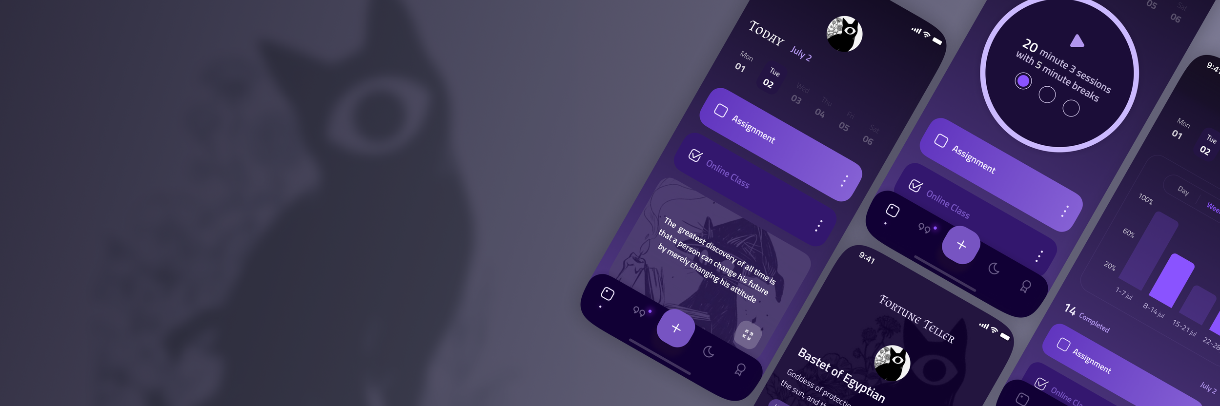
improve your concentration & self-esteem with handy features
Grimoire is a focus tool. Discover and collect summoners and taro cards, get inspired by positive quotes, and facilitate your real-life tasks with a collection of handy features designed to improve concentration and ease stress.
Overview
Background
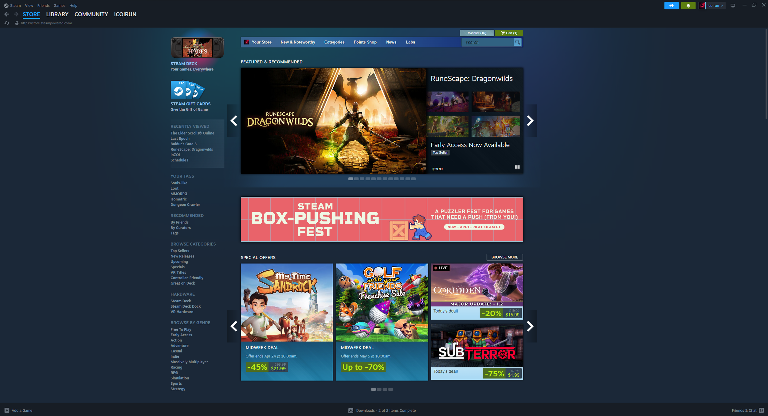
This is a conceptual redesign of Steam, the world’s largest PC game platform. The project focuses on improving visual hierarchy, enhancing user engagement, and optimizing navigation to create a more intuitive and modern user experience.
It aims to reimagine the Steam interface from a fresh, user-centric perspective, with an emphasis on clarity, accessibility, and emotional resonance.
My role
I led the entire design process—from identifying usability issues and redefining user flows, to crafting high-fidelity mockups and building an interactive prototype.
This was a solo concept project created to explore new UX paradigms in game platform interfaces.
UX Research & Heuristic Evaluation
UI Redesign and Wireframing
Visual & Interaction Design
Web Structure & Flow Planning
Solo Concept Execution
Goal
The ultimate goal was to transform the cluttered and overwhelming experience of the original interface into something elegant, intuitive, and delightful.
Modernize Steam’s outdated and visually dense UI
Streamline the user journey for smoother discovery and interaction
Emphasize featured and trending games with stronger visual storytelling
Establish consistency across sections to reduce cognitive load
discovery
During user testing, we identified multiple usability issues with the current Steam interface.
The core problems were:
Users felt overwhelmed by the dense content and numerous banners, making it difficult to focus on what mattered.
There was no clear visual hierarchy, leading to confusion between promotional content, featured games, and ongoing sales.
Navigation through categories and genres was unintuitive, with buried options and redundant lists.
The interface was heavily text-based, lacking emotional engagement or visual storytelling.
On the game detail pages, important actions like “purchase” or “read reviews” were difficult to locate within cluttered layouts.
Problems with the Current Steam Website
| Problem | Description |
|---|---|
| Information Overload | The homepage displays too many banners and dense content at once, leading to scattered attention. |
| Lack of Visual Hierarchy | Promotional sections, featured games, and sales are presented without clear prioritization. |
| Complex Navigation Structure | Genre categories and filters are buried or repeated, creating a high barrier to entry. |
| Text-Dominant Design | The interface relies heavily on textual information, with minimal emotional or visual engagement. |
| Cluttered Game Detail Pages | Game pages are content-heavy and overwhelming, with key actions like purchase or reviews buried in clutter. |
Improvements in the Steam Redesign
| Improvement | Description |
|---|---|
| Refined Information Structure | The homepage layout is reorganized to focus on key content areas such as recommendations, sales, and genres. |
| Strong Visual Hierarchy | Large typography and featured banners direct user attention and guide content consumption in a structured flow. |
| Simplified Navigation Flow | Genre and theme-based navigation is placed prominently at the top, reducing friction. |
| Visual-Centric Experience | The design emphasizes immersive screenshots and image cards to deepen emotional connection with content. |
| Improved Game Detail Page | Key elements like purchase options, trailers, and reviews are modularized into cards for clarity and ease of use. |
Before
Overwhelming homepage with multiple carousels and banners
Weak visual hierarchy and dense sidebar menus
Text-heavy structure with minimal emotional impact
Discovery options buried in long lists with small icons
Lack of modularity in layout; inconsistent section spacing
Before
Cluttered layout with small elements and unclear structure
Key details (cloud save, play time, achievements) presented flatly
Feeds like activity logs and updates lack visual impact
No clear visual differentiation between information types

Before
Feels outdated with flat design and dense layout
Static modules for guides, reviews, and screenshots
Minimal interactivity or gamification elements
Search-heavy interface with weak visual cues
Lacks personalization or real-time relevance

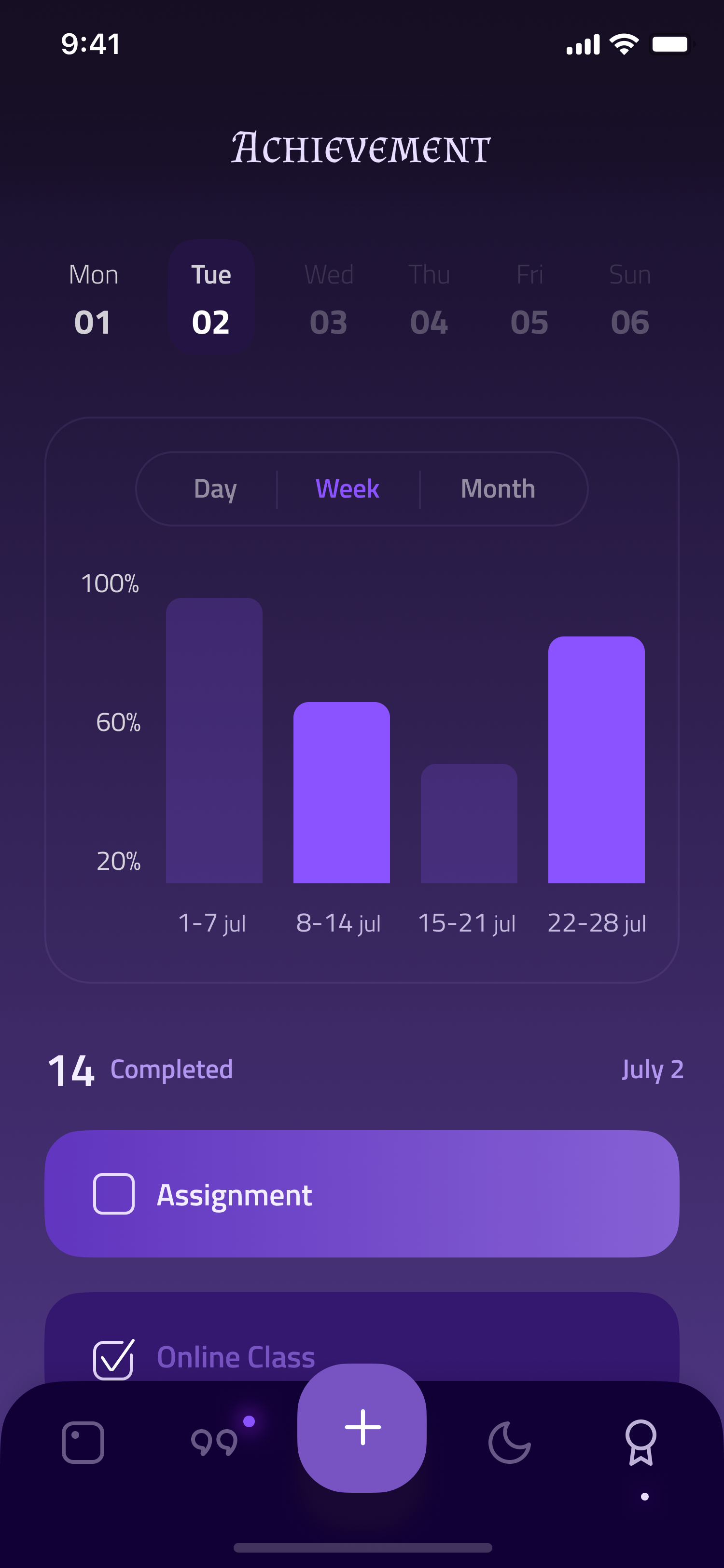
After
Community now feels alive and mission-driven with “Quests”
Visually engaging tiles replace text-heavy sections
“Channel You Play” creates a personalized community hub
Live status (e.g. online player count) adds social presence
Encourages engagement through gamified interaction design

Before:
Text-heavy layout with minimal visual hierarchy
Static list of recently played games, badges, and comments
Lack of interaction, real-time content, or personality
No highlights or “showcase” moments
Customization is limited to colors/backgrounds

After
Clean, grid-based structure with wide spacing and clear segmentation
Hero banner draws attention to top content with cinematic appeal
Discovery by tag and genre made visually intuitive with filter chips
Modular card-based layout supports faster scanning and action
Typography, color, and contrast improved for readability and engagement

After
Hero-style banner creates emotional engagement with owned titles
All game data (status, playtime, achievements) visually grouped and prioritized
Sections like Patches, Media, Reviews, and Community are modularized
Visual storytelling: rich previews, thumbnails, and interaction options

After
Live streaming banner creates a real-time connection point
“Showcase” section highlights achievements like speedruns
Recently played games shown in a clean, card-style layout
Friend activity and profile summary moved to the side for clarity
Gamified design language adds fun and ownership to the page

scenarios
Persona
According to a poll of 1,000 employees by market research firm Embrain Trend Monitor, more than 7 out of 10 (75.2%) were involved in self-development. The most popular self-development ways were [multiple responses] exercise (60.3%), foreign languages (48.8%), certificates (48%), hobbies (36.8%), financial planning (32.2%), and IT-related studies (17.8%).
Why do people focus on self-development even after work?
The biggest reason is to prepare for something other than their main job. This is also why the persona was set as a 30-something employee like Chloe. The character is represented as someone who overcomes obstacles in their personal and professional lives and achieves personal success.


PROTOTYPE
Iteration Learnings
Connecting rewards with task completion in Grimoire can be achieved by integrating them naturally into the app’s mystical theme and ensuring they are meaningful to the user’s journey. Expressing rewards through visual storytelling, personalization, and thematic integration enhances the experience. Unlocking new quote categories and tarot card services can serve as strong motivational tools, while providing an initial set of 22 Major Arcana tarot cards offers a rich foundation that can be expanded over time.
Some key insights:
How can I naturally connect the reward for completing a task to other main functions?
How will I express the reward?
Can the unlocking of the category of quotes and the unlocking of the Tarot card service be motivation for completing the task?
How many illustrations of Tarot cards will I provide?
I’d sketched out wireframes based on the information architecture. In addition to the guide to life and the process of unlocking the summoner model, I’d mainly built important features first. I continued to iteratively fix issues that were unexpected in the architecture while drawing wireframes.
WIREFRAME

PROTOTYPE
DESIGN
CONcept
The design concept of Grimoire reflects a serene and mystical.
I've designed it with a deep purple tone that provides a calming, focused atmosphere, making the users enhance concentration and reduce stress.
Mystical Theme: The design concept revolves around a mystical, enchanted world where productivity is enhanced through the guidance of magical beings, such as summoners, and the wisdom of tarot cards. The interface should feel like a digital grimoire—ancient yet infused with modern elements—creating a unique and immersive experience.
Seamless Integration: All features are designed to interconnect, making it easy for users to transition from task management to stress relief or inspiration, all within a cohesive, visually rich environment.


iNTERACTION
The interaction animations in Grimoire are designed to create an immersive and magical experience. Each animation is carefully crafted to reinforce the mystical theme of the app, making every action—from summoner selection to task completion—feel meaningful and engaging. These animations not only enhance the user experience but also help to build a strong emotional connection to the app, making it a central part of the user’s daily routine.
REFINEMENT
This redesign challenged me to balance dense content architecture with a simplified, emotionally engaging user experience. As a gamer and designer, I wanted to honor the legacy of Steam while exploring how a modern design system could elevate its usability and visual appeal. The result is a platform that feels familiar but functions with far greater clarity, flow, and visual coherence.
Challenges Ahead
To improve the task habits or concentration feature so that it becomes the main tool of the Grimoire app, consider focusing on the following strategies:
1. Naturally Connecting Rewards for Task Completion with Other Main Functions:
Progressive Unlocking System: As users complete tasks, they earn points or tokens that can be used to unlock various features within the app, such as new summoners, tarot cards, or quote categories. This creates a sense of progression and encourages continued engagement.
Task-Linked Rewards: For specific tasks, users could be rewarded with relevant rewards that tie into the app's themes, such as unlocking a new summoner that embodies the traits needed for that task (e.g., focus, creativity, calm). This makes the rewards feel more purposeful and connected to the user’s journey.
Mystical Achievements: Completing a series of tasks or reaching milestones could unlock special tarot readings or personalized quotes that reflect the user’s journey. These achievements could be tied to the narrative of the summoners or tarot, making the experience feel more immersive.
2. How to Express the Reward:
Visual and Thematic Presentation: Rewards should be presented with a sense of ceremony, using mystical visuals and animations to enhance the experience. For example, when a user unlocks a new tarot card, the card could appear in a dramatic reveal, accompanied by a brief message or affirmation that ties into the card’s meaning.
Narrative Integration: Each reward can be introduced with a short narrative or explanation that ties it into the app’s overall theme. For example, unlocking a new quote category could be framed as "Discovering the hidden wisdom of the ancients," making the reward feel like part of the mystical journey.
Personalization: Whenever possible, tailor the rewards to the user’s recent activities or preferences. For example, if a user has been focusing on stress management, the reward could be a calming summoner or a tarot card that offers guidance on relaxation.
3. Unlocking Quote Categories and Tarot Card Services as Motivation:
Unlocking Quote Categories: Users could unlock new categories of quotes (e.g., "Wisdom of the Elders," "Focus and Determination," "Peace and Calm") as they complete tasks. Each category could offer a unique set of quotes that resonate with different aspects of their journey, providing ongoing motivation.
Unlocking Tarot Card Services: Tarot cards could be unlocked as users complete tasks or reach specific milestones. These cards might offer unique insights or guidance that can only be accessed through task completion, making them a valuable reward. Additionally, unlocking new tarot readings or more advanced card spreads could be tied to the user’s progress, encouraging them to keep completing tasks to access deeper levels of wisdom.
4. Number of Tarot Card Illustrations to Provide:
Core Deck: Consider starting with a core set of 22 Major Arcana tarot cards, which are rich in symbolism and provide meaningful insights. These cards are often seen as the most powerful in a tarot deck and would offer a strong foundation.
Expansion Opportunities: You could gradually expand the deck by introducing Minor Arcana cards (typically 56 cards), or even create custom cards that are unique to the Grimoire app. This allows you to release new cards as part of updates or special events, keeping the experience fresh and engaging.
Unlockable Cards: To enhance the sense of reward, some tarot cards could be unlockable only through significant achievements within the app, such as completing a long-term goal or mastering a certain number of tasks.